Image Details
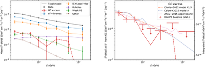
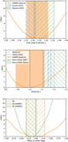
Caption: Figure 8.
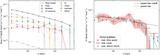
Left panel: the mean flux of the observed data and the components in the baseline model within the ROI. The red points show the flux of the GC excess. The masked regions are excluded from the calculation. Right panel: the baseline SED of the GC excess observed by DAMPE (red points). The left y-axis represents the SED at an angle of 5∘ from the GC, whereas the right y-axis is the flux integrated over the circle <10∘ from the GC excluding 2∘ of the Galactic plane. 95% upper limits are shown when the TS values are below four. The red dashed line connects the best-fit flux points. The GC excess follows the J-factor template given the gNFW profile with γ = 1.2. Some of the Fermi-LAT observations are also shown with lines.
Other Images in This Article
Show More
Copyright and Terms & Conditions
© 2026. The Author(s). Published by the American Astronomical Society.