Image Details
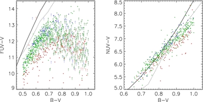
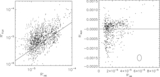
Caption: Figure 5.
Color–color diagrams comparing our synthetic UV fluxes to our observations with GALEX. Colors have the same meaning as in Figure 2. The dotted curve shows the stellar locus predicted by matching the synthetic FUV and NUV magnitudes calculated for each model temperature with the photometry listed by Kraus & Hillenbrand (2007) for the same temperature. The results differ markedly from the observations, particularly in the NUV, where the synthetic magnitudes imply that a large fraction of stars emit less UV flux than their photospheres can account for. The solid curve shows the stellar locus after the photosphere FUV and NUV magnitudes have been corrected for temperature systematics as described in the text; the results appear much more consistent with the NUV observations.
Other Images in This Article


Show More
Copyright and Terms & Conditions
© 2011. The American Astronomical Society. All rights reserved.