Image Details
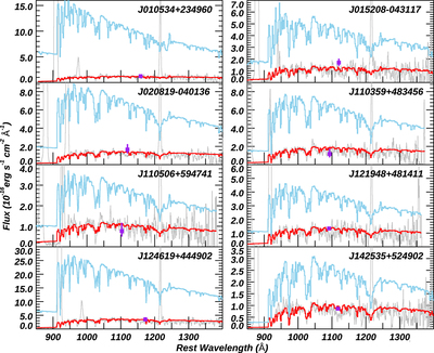
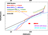
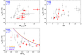
Caption: Figure 4.
A comparison of the observed data and our best-fitting BPASS models. The COS G140L spectra are shown with gray lines, and photometric data from GALEX FUV are shown with purple squares. All data are dereddened by MW extinction (see Section 2.2). The red curves represent the BPASS models and are dereddened by only MW extinction. The blue curves are the models dereddened for both MW and internal extinction, which represents the intrinsic flux (see Section 3.1.1). We have resampled the data to bins of ∼2.5 Å to match the model's resolution.
Other Images in This Article
Show More
Copyright and Terms & Conditions
© 2022. The Author(s). Published by the American Astronomical Society.
Copyright ©
2025 Astronomy Image Explorer. All Rights Reserved.