Image Details
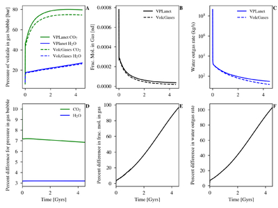
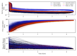
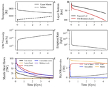
Caption: Figure 3.
Comparison between the outgassing model in VPLanet (solid lines) and in VolcGases (dotted lines). The top row displays true values, while the bottom row displays the percent difference between each model. The first column illustrates the difference in the partial pressure of CO2 (green) and H2O (blue) in the gas bubble. The second column illustrates the difference in the fraction of moles in the gas phase vs. the melt phase, αgas. The third column illustrates the difference in the water outgassing rate, calculated from ﹩{P}_{{{\rm{H}}}_{2}{\rm{O}}}﹩ and αgas.
Other Images in This Article
Show More
Copyright and Terms & Conditions
© 2026. The Author(s). Published by the American Astronomical Society.
Copyright ©
2026 Astronomy Image Explorer. All Rights Reserved.