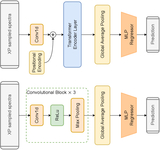
Image Details
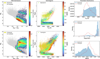
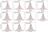
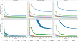
Caption: Figure 1.
Comparison of the parameter space distributions between the training dataset (APOGEE labels) and the application dataset (open cluster members). Left panels: color–magnitude diagrams showing the domain coverage (MG vs. GBP − GRP). The background gray points represent the entire sample of quality-filtered open cluster candidates. The overlaid density contours (logarithmic scale) display the distribution of the final matched application set (top) and the training set (bottom). Middle panels: Kiel diagrams (﹩\mathrm{log}g﹩ vs. Teff) illustrating the physical parameter distribution. The points are color-coded by their metallicity ([M/H]). The top panel shows the matched open cluster members, while the bottom panel depicts the training sample. Right panels: normalized one-dimensional distribution comparisons for effective temperature (Teff), surface gravity (﹩\mathrm{log}g﹩), and metallicity ([M/H]). The blue shaded histograms represent the final matched application set, while the red dashed lines represent the training dataset.
Other Images in This Article
Show More
Copyright and Terms & Conditions
© 2026. The Author(s). Published by the American Astronomical Society.