

Image Details
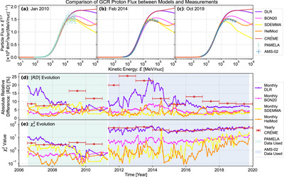
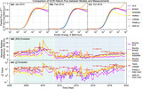
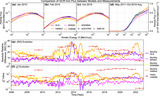
Caption: Figure 8.
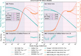
Comparison of the GCR proton flux between models and measurements: (a) 2010 January, (b) 2014 February, and (c) 2019 October. In each of these three panels, the proton flux given by the DLR, BON20, SDEMMA, HelMod, and CRÈME models is in purple, magenta, yellow, orange, and red, respectively. The measured flux from PAMELA and AMS-02 experiments is plotted as light-green and blue scattered points with systematic errors, respectively. Two additional panels provide the temporal evolution of the comparison: (d) absolute relative difference (﹩\left|{RD}\right|﹩) between the model predictions and measurements and (e) ﹩{\chi }_{\nu }^{2}﹩ value. The light-green shaded area represents the time span when the PAMELA flux data are used (from 2006 July to 2011 April), while the blue shaded area represents the time span when the AMS-02 flux data are used (from 2011 May to 2019 October).
Other Images in This Article
Show More
Copyright and Terms & Conditions
© 2024. The Author(s). Published by the American Astronomical Society.

