Image Details
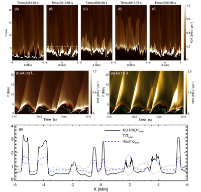
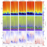
Caption: Figure 9.
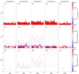
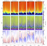
Evolution of the synthesized emission count rate in the 2.5D run with initial magnetic field B0 = 5 G. Panels (A)–(E) show the distributions of the synthesized emission count rate in AIA 193 Å at five different times within a cycle of spicule formation, as in Figure 4. The animations of the corresponding synthesized emission count rate in AIA 171 and AIA 193 Å are available in the online journal. Panels (F) and (G) show the synthesized results varying with time along the Y-direction at X = −4.15 Mm. Here, RDT is the synthesized emission count rate, and the unit of RDT is DN s−1 pixel−1. The red solid curve and the green dashed curve in panels (F) and (G) correspond to the two locations where T = 80,000 and 8000 K, respectively. Panel (H) presents the distributions of the normalized synthesized emission count rate in AIA 193 Å (black solid line), the normalized plasma temperature (red dotted line), and normalized density (blue dashed line) along the X-direction at Y = 5.5 Mm (the white dashed line in Figure 9(B)) at t = 3519.96 s.
(An animation of this figure is available in the online article.)
(An animation of this figure is available.)
The video/animation of this figure is available in the online journal.
Other Images in This Article
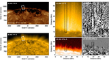
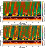
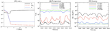
Show More
Copyright and Terms & Conditions
© 2026. The Author(s). Published by the American Astronomical Society.