Image Details
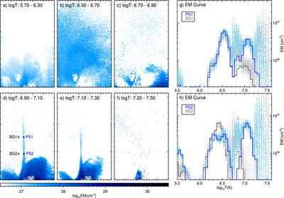
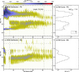
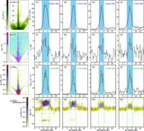
Caption: Figure 3.
DEM results of the 2013 May 13 flare. (a)–(f) EM maps in integrated temperature ranges. Maps are rotated for a better visibility. (g), (h) Comparison of DEM distributions from the PS and nearby reference locations. The EM curves are sampled from locations indicated by small boxes (averaged over 3 × 3 pixel2) in panel (d), PSs in blue and BGs in black, respectively. The light blue and gray curves are corresponding uncertainties from 250 Monte Carlo simulations.
Other Images in This Article
Show More
Copyright and Terms & Conditions
© 2024. The Author(s). Published by the American Astronomical Society.
Copyright ©
2026 Astronomy Image Explorer. All Rights Reserved.