Image Details
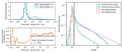
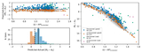
Caption: Figure 7.
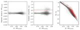
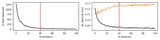
Correlation between RUWE and overluminosity. The top left panel shows the difference distribution of the predicted and actual Gaia absolute G-band magnitudes. The high- and low-RUWE stars within the Full Sample defined in Section 3 are shown, with the high-RUWE sample showing a clear peak at the equal-mass offset (∼0.75). The bottom left panel shows the fraction of the sample that has an inflated RUWE in the data (orange). We also plot the predicted fraction of binaries (black) that lie above our magnitude cutoff and have inflated RUWE from our simulation in Section 2. The right panel shows the RUWE distribution for the overluminous and normoluminous stars in the Full Sample. We also include the distribution for the single and binary systems from our simulation.
Other Images in This Article
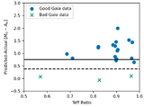
Show More
Copyright and Terms & Conditions
© 2026. The Author(s). Published by the American Astronomical Society.