Image Details
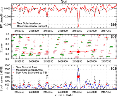
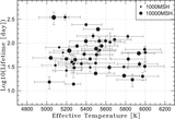
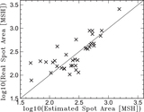
Caption: Figure 10.
Example of the Sun-as-a-star analysis from 2014 March 5 to 2015 March 5. (a) The red solid line is the light curve of the TSI observed by the SORCE satellite. The data are plotted with a 6 hr time cadence, and the values are normalized by the median values of the TSI in the observational period. The black dashed line is the light curve reconstructed from the daily sunspot area. (b) Phase-time diagram. Red points correspond to the local minima detected in panel (a) compared to the rotational period (see Carrington longitude). Green and pink circles are the spatially resolved sunspot locations in the northern and southern solar hemisphere, respectively. In this panel, sunspot data are plotted only for sunspots with an area >100 MSH. Symbol sizes correspond to the spot area, but the scales of the red and others are different for visibility. (c) Temporal evolution of sunspot area. Red circles correspond to the area estimated from the depth of the local minima of the TSI. The dashed black line represents the daily total sunspot area, and the blue solid line is the area of the largest sunspot for each date.
Other Images in This Article


Copyright and Terms & Conditions
© 2019. The American Astronomical Society. All rights reserved.