Image Details
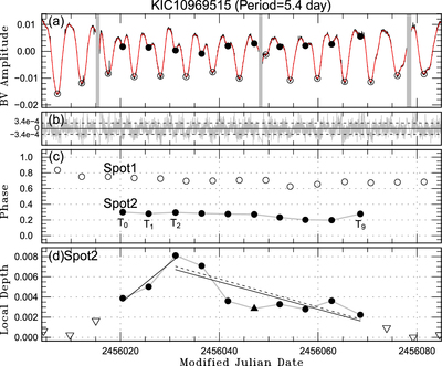
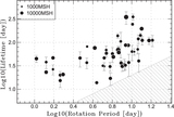
Caption: Figure 1. Temporal evolution of star-spot candidates
The complete figure set (56 images) is available in the online journal.
An example of the temporal evolution of one star spot successfully measured in this study. (a) The background black line is the observed Kepler light curve, and the red line is the fitted one. Vertical gray lines correspond to the observational gaps longer than 5 hr. Filled circles are the local minima of a detected spot candidate, and open circles are the local minima of another spot. (b) Residual errors between the original Kepler light curve and the fitted one. (c) Phase-time diagram, where the vertical axis corresponds to phases of the local minima detected in the upper panels compared to the rotational period (see Carrington longitude). Symbols are the same as above. Open circles correspond to other spot candidates, but they are not included in our catalog because their temporal evolution is not well measurable. (d) Temporal evolution of the depth of the local minima from the nearby local maxima of the spot candidates that we focus on. The filled triangle is the local minima near the observational gaps. The open triangles indicate the upper limit of the brightness variation before the spot emerges and after the spot disappears. The black solid lines are the fitted lines of the emergence and decay phase (for data unaffected by data gaps), and the dashed lines are the same as the solid ones but fitted only for the black circles. Figures for the other 55 spot candidates are available in the online version of the Journal.
Other Images in This Article


Copyright and Terms & Conditions
© 2019. The American Astronomical Society. All rights reserved.