

Image Details
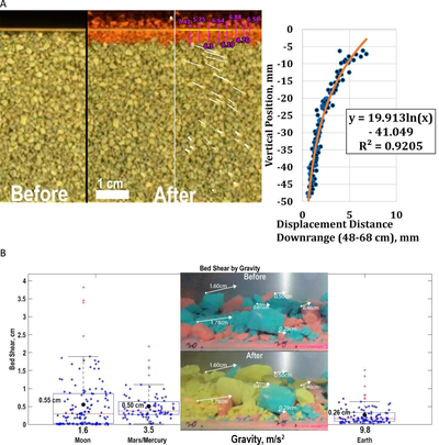
Caption: Figure 10.
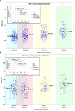
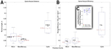
(A) Before (left of vertical black bar) and after (right of vertical black bar) views of regolith displacement as a function of depth with the addition of ejecta (red; emplaced from left to right) grains for the large ground-based catapult; this represents reanalyzed data from K. D. Runyon & O. S. Barnouin (2018). In the “After” pane, the annotated version is on the right side of the vertical white bar, and the unannotated version is on the left side of the vertical white bar. The red ejecta grains were emplaced traveling from left to right and ranged in diameter from 1 to 3 mm. This experiment was conducted using the ∼1 m2 ground-based catapult at Johns Hopkins APL in 2016. Magenta lines and numbers indicate the depth of ejecta deposition (above the yellow line) and regolith erosion (below the yellow line) in millimeters. Shear is described as a logarithmic function of depth. (B) Measurable bed shear as a function of gravity (which is convolved with ejecta speed) using the smaller flight catapult. Considering the shear means, interquartile ranges, and full ranges, subsurface bed shear is negatively correlated with gravity and/or ejecta speed. The inset image shows an example from the small flight catapult of a “before” and “after” measurement of bed shear from the Proximal-2 camera position on the third Mars/Mercury parabola. The “20” and “25” fiducial markings are centimeters from the small catapult. The yellow-colored chalk grains are ejecta that were emplaced from left to right. (The box-and-whisker plot shows the middle 50% of data (i.e., the interquartile range from the 25th–75th percentiles), the whiskers show the data range less the outliers, and the furthest outliers are shown in red +’s. The red lines and black dots denote the median and mean of each dataset, respectively. The x-axis is semiquantitative; horizontal data spread within a box is only to enhance readability and does not indicate a variation in x-axis value.)
Other Images in This Article
Show More
Copyright and Terms & Conditions
© 2026. The Author(s). Published by the American Astronomical Society.

