Image Details
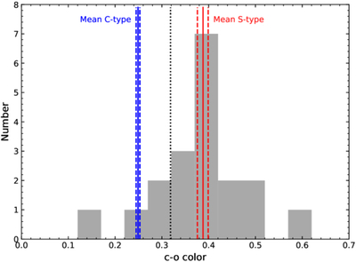
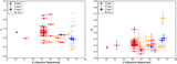
Caption: Figure 5.
Histogram of ATLAS c − o colors for our targets compared with the expected mean Bus–DeMeo S- and C-type colors. The c – o color is shown on the x-axis, and the number of targets per bin is shown on the y-axis. The black vertical line marks the midpoint between the mean Bus–DeMeo S- and C-type colors, used to separate classifications. Vertical solid lines show the mean Bus–DeMeo C-type (blue) and S-type (red) colors, with dashed lines indicating the ±1σ ranges. Some targets have uncertainties spanning both regions, but classifications are based on measured values. Compared with Figure 3(b) in N. Erasmus et al. (2020), only the far left (c – o ≈ 0.15) and far right (c – o ≈ 0.6) data points are extreme outliers within the larger Koronis ATLAS dataset.
Other Images in This Article
Show More
Copyright and Terms & Conditions
© 2026. The Author(s). Published by the American Astronomical Society.