Image Details
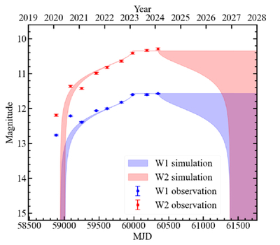
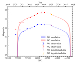
Caption: Figure 5.
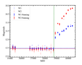
Comparison of simulated and observed IR light curves of AT 2019qiz. The blue and red dots denote the observational magnitudes of W1 and W2, respectively. The shaded blue and red areas denote the spread of the simulated light curve of the top 1% of the posterior samples with the highest likelihood values.
Other Images in This Article
Copyright and Terms & Conditions
© 2025. The Author(s). Published by the American Astronomical Society.
Copyright ©
2025 Astronomy Image Explorer. All Rights Reserved.