Image Details
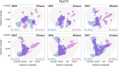
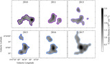
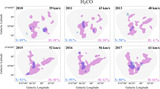
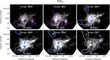
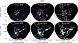
Caption: Figure A1.
A visual representation of the OP calculation done for the individual years of X-ray observations (given in the upper left of each panel) and the H2CO observations divided into the same velocity ranges shown in Figure 2 (given in the upper right of each panel). The blue-filled shapes are the X-ray contours at a level of 3 × 10⁻⁹ counts s−1 cm−2 pixel−1 shown as the outer contours in previous figures, and they trace even the diffuse X-ray emission from the cloud. The pink-filled shapes are the 3σ H2CO contours. The purple regions show where the two sets of contours overlap. The OPs with X-ray being the primary data set are shown in blue in the lower left of each panel, and the percentages with H2CO being the primary data set are shown in pink in the lower right of each panel.
Other Images in This Article
Copyright and Terms & Conditions
© 2025. The Author(s). Published by the American Astronomical Society.