Image Details
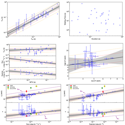
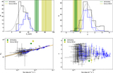
Caption: Figure 3.
Correlation plots for time-integrated spectral fitting. The same method of linear regression is imported from Tu & Wang (2018). The black solid lines represent the best-fitting results. The red and yellow dotted lines represent 1σv and 2σv regions of extra variability, respectively (D’Agostini 2005), and the gray areas mark the 95% confidence interval of fitting uncertainties. The black dashed line in the top-left panel is Tbb = T90. The red, green, and yellow data points in the bottom panels are the same as the corresponding value with identical color in Figure 2. The purple dashed lines indicate upper/lower limits of several times of σv region that can contain the red points.
Other Images in This Article
Copyright and Terms & Conditions
© 2021. The American Astronomical Society. All rights reserved.