Image Details
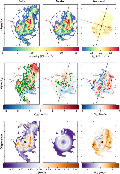
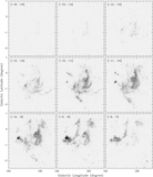
Caption: Figure 14.
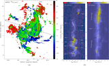
Comparison between the observational data and the modeled results from the 3DBAROLO. From top to bottom, the rows sequentially show the comparison between the observation and the model in terms of the integrated intensity, intensity-weighted mean velocity, and velocity dispersion, respectively. From left to right, the columns display the data, the model, and the residual maps. Black ellipses represent the projection of the outermost ring used in the fitting. The black dashed line indicates the major axis of the ellipse (along the average PA of the fitted rings), while the red dashed line marks the minor axis. Gray lines in the second row trace the PA trajectories at different radii, and the green contours denote the zero-velocity loci in these maps.
Other Images in This Article
Show More
Copyright and Terms & Conditions
© 2026. The Author(s). Published by the American Astronomical Society.