Image Details
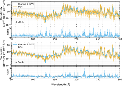
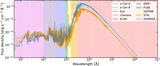
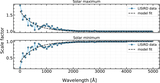
Caption: Figure 10.
Comparison of the α Cen A (top) and B (bottom) DEM flux to the observed flux from Chandra and EUVE. Each two-panel subplot is laid out as follows. Top: synthetic X-ray to EUV (XUV) spectrum from the DEM (orange) compared with the observed α Cen spectrum from Chandra LETGS and EUVE (blue). All data are binned to 1 Å. Bottom: ratio of DEM flux to observed flux.
Other Images in This Article
Show More
Copyright and Terms & Conditions
© 2026. The Author(s). Published by the American Astronomical Society.
Copyright ©
2026 Astronomy Image Explorer. All Rights Reserved.