Image Details
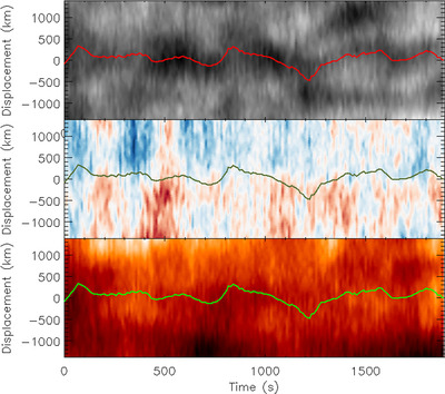
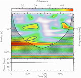
Caption: Figure 7.
Time–distance diagrams illustrating the data analysis of a fibril oscillation, with a displacement of 0 km corresponding to the average fibril axis. The top panel shows line-core intensity, with the overplotted red line representing the calculated central position of the fibril as it undergoes FAF x-transverse oscillations. This same line is overplotted on the middle and bottom panels. The middle panel shows FAF y-velocity, and the bottom shows the Hα line width.
Other Images in This Article
Show More
Copyright and Terms & Conditions
© 2024. The Author(s). Published by the American Astronomical Society.
Copyright ©
2025 Astronomy Image Explorer. All Rights Reserved.