Image Details
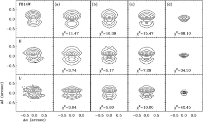
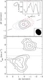
Caption: Figure 10.
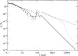
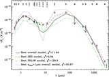
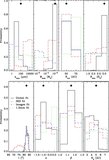
Contour plots of HV Tau C at 0.8 μm (top row), 1.6 μm (middle row), and 3.8 μm (bottom row). From left to right, the columns represent: the actual data, the best model in our grid at each wavelength (a), the best model to all three scattered light images simultaneously (b), the best overall model (c), and the best fit to the SED alone (d). All model images have been convolved with the appropriate PSF. In each plot, the contours lie at 80%, 40%, 20%, 10%, and 5% of the peak.
Other Images in This Article
Copyright and Terms & Conditions
© 2010. The American Astronomical Society. All rights reserved.
Copyright ©
2025 Astronomy Image Explorer. All Rights Reserved.