Image Details
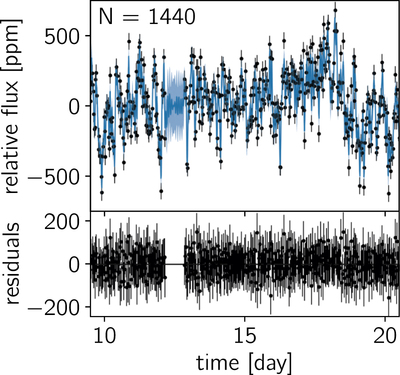
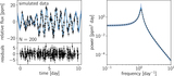
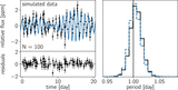
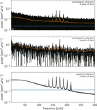
Caption: Figure 8.
Top: Kepler data (black points) and the MAP model prediction (blue curve) for a 10-day subset of the month-long data set that was used for the fit. The solid blue line shows the predictive mean, and the blue contours show the predictive standard deviation. Bottom: residuals between the mean predictive model and the data shown in the top figure.
Other Images in This Article
Show More
Copyright and Terms & Conditions
© 2017. The American Astronomical Society. All rights reserved.
Copyright ©
2025 Astronomy Image Explorer. All Rights Reserved.