Image Details
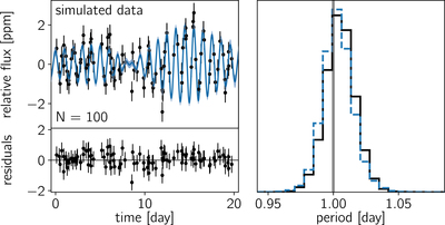
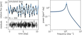
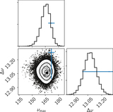
Caption: Figure 5.
Top left: simulated data set (black error bars) and MAP model (blue contours). Bottom left: residuals between the mean predictive model and the data shown in the top left panel. Right: inferred period of the process. The true period is indicated by the vertical gray line, the posterior inference using the correct model is shown as the blue dashed histogram, and the inference made using the “wrong” effective model is shown as the black histogram.
Other Images in This Article
Show More
Copyright and Terms & Conditions
© 2017. The American Astronomical Society. All rights reserved.
Copyright ©
2025 Astronomy Image Explorer. All Rights Reserved.