Image Details
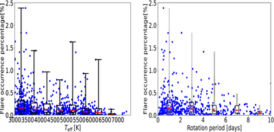
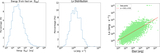
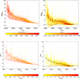
Caption: Figure 4.
Distribution of flare occurrence percentages as a function of effective temperature and rotation period. Left panel: the relationship between effective temperature and flare occurrence percentage, displayed with overlaid box-and-whisker plots. Right panel: the relationship between rotation period and flare occurrence percentage, illustrated using violin plots combined with box-and-whisker plots. In both panels, blue dots indicate individual stars, showing their effective temperature or rotation period alongside the corresponding flare occurrence percentage. The box plots depict the data quartiles, where the upper and lower horizontal lines correspond to the third (3/4) and first (1/4) quartiles, respectively, and the red line marks the median. The yellow violin plots reveal the overall distribution shape.
Other Images in This Article
Show More
Copyright and Terms & Conditions
© 2026. The Author(s). Published by the American Astronomical Society.