

Image Details
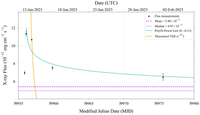
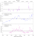
Caption: Figure 5.
Close-in look at the second subregion (the blue region of Figure 3) of the large flare highlighted in pink in Figure 1. We again attempted to fit the data as a TDE by using a polyfit power law and comparing it to a theoretical model. The blue line corresponds to the calculated fit, and the orange line corresponds to the theoretical fit of the data if the data were a TDE. Once again, the fit to this peak does not resemble the theoretical decay pattern of a TDE.
Other Images in This Article

Copyright and Terms & Conditions
© 2026. The Author(s). Published by the American Astronomical Society.

Copyright ©
2026 Astronomy Image Explorer. All Rights Reserved.
