

Image Details
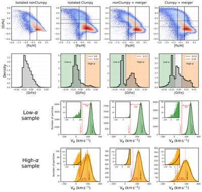
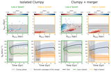
Caption: Figure 3.
From left to right, the columns show the Isolated nonClumpy, Isolated Clumpy, nonClumpy+merger, and Clumpy+merger simulations. First row: projection onto the [O/Fe]–[Fe/H] plane, where red colors indicate regions of highest stellar density; the vertical lines delimit the interval −0.7 < [Fe/H] < −0.2, and the dashed horizontal line marks the cutoff separating the high- and low-α populations. Second row: [O/Fe] distributions within −0.7 < [Fe/H] < −0.2 for each simulation; the dashed vertical lines indicate the high- and low-α separation. Third row: Vϕ distributions for the low-α population in the three simulations that form a bimodality. The inset panels show a zoom of the Splash region, and the dashed vertical line indicates the 〈Vϕ〉 of each Gaussian fit. Fourth row: same as the third row, but for the high-α population. In the third and fourth rows, the red dashed vertical lines indicate the cutoff used to select the Splash population, accompanied by the exact Vϕ adopted.
Other Images in This Article
Copyright and Terms & Conditions
© 2026. The Author(s). Published by the American Astronomical Society.

