

Image Details
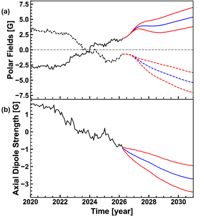
Caption: Figure 3.
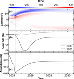
Prediction of solar cycle evolution. Panel (a) shows the evolution of the polar field, with the black curve representing observations from HMI; the blue solid and dashed curves representing the average values of predictions for the southern and northern hemispheres, respectively; and the red curves representing the corresponding 1 standard deviation ranges. Panel (b) shows the evolution of the axial dipole moment, with black representing observations from HMI, blue representing average of predictions, and red representing 1 standard deviation ranges.
Other Images in This Article
Copyright and Terms & Conditions
© 2026. The Author(s). Published by the American Astronomical Society.

Copyright ©
2026 Astronomy Image Explorer. All Rights Reserved.
