

Image Details
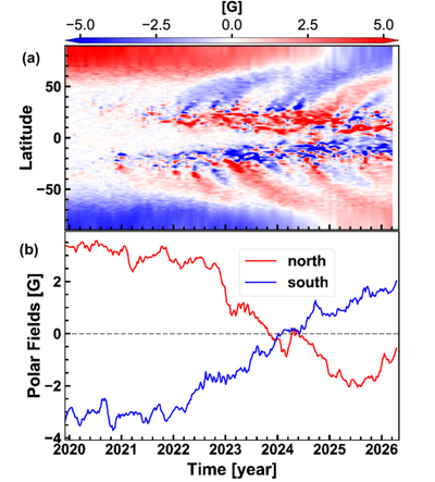
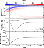
Caption: Figure 1.
Observational large-scale magnetic field evolution of the Sun during cycle 25. Panel (a) shows the latitudinally averaged time–latitude diagram (i.e., magnetic butterfly diagram) from the data of HMI. Panel (b) shows the evolution of the polar field from the data of HMI, obtained by averaging the magnetic field between latitudes 60∘ and 90∘ and smoothed by averaging within a window of 3 months. The red curve indicates the north pole while blue indicates the south pole.
Other Images in This Article
Copyright and Terms & Conditions
© 2026. The Author(s). Published by the American Astronomical Society.

Copyright ©
2026 Astronomy Image Explorer. All Rights Reserved.
