Image Details
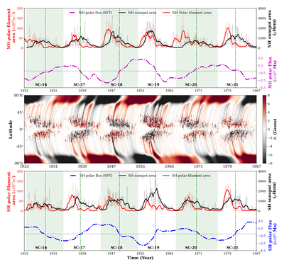
Caption: Figure 3.
Top panel: the red curve shows the time series of the polar filament area in the northern hemisphere from solar cycles 16–21, while the black curve represents the northern hemispheric sunspot area obtained from S. Mandal et al. (2020). The lighter red and black curves in the background indicate the Carrington-rotation-aggregated and monthly averaged polar filament area and sunspot area, respectively, while the darker red and black curves show their corresponding 13 month running averages. The magenta curve denotes the northern hemispheric polar flux generated from the data-driven optimized surface flux transport (SFT) model. Green dashed lines indicate the epochs of polar field reversal. Middle panel: this panel shows the spatiotemporal distribution of the radial magnetic field (Br) from solar cycles 16–21, generated using a data-driven optimized SFT model (S. Pal & D. Nandy 2025). Red and black colors represent regions of positive and negative magnetic polarity, respectively. Bottom panel: the red curve shows the time series of the polar filament area in the southern hemisphere from solar cycles 16–21, while the black curve represents the southern hemispheric sunspot area obtained from S. Mandal et al. (2020). The lighter red and black curves in the background indicate Carrington-rotation-aggregated and monthly averaged polar filament parameters and sunspot area, respectively, while the darker red and black curves represent their corresponding 13 month running averages. The blue curve denotes the southern hemispheric polar flux generated using the same SFT model . Green dashed lines indicate the epochs of polar field reversal.
Other Images in This Article
Copyright and Terms & Conditions
© 2025. The Author(s). Published by the American Astronomical Society.