Image Details
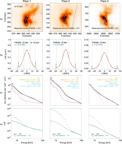
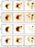
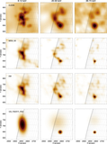
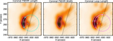
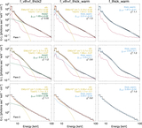
Caption: Figure 10.
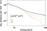
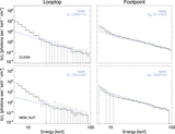
Columns show Flares 1, 2, and 3. Row (a): X-ray image of the flare, in the 6–12 keV energy bin, white contours show the 50% intensity level. Green arrows depict the coronal source FWHM. Row (b): simulated nVF distribution [electrons s−1 cm−2 keV−1] in space z, where the loop apex is z = 0 Mm. Green dashed lines indicate the chromospheric boundary. Yellow dotted lines show the observed coronal source FWHM. Blue dashed lines show the spatial extent of the acceleration region. Coronal emission is fitted with a Gaussian distribution (red). Row (c): observed spatially integrated photon flux spectrum (black), integrated over an ≈100 s time period. This is fitted with a thermal distribution (yellow) and a warm thick-target model (red). Background emission is shown in purple. Row (d): simulated electron spatial distribution nVF [electrons s−1 cm−1 keV−1] in energy, with (green) and without (black) the addition of a background thermal component. Solid lines show the spectral fitting (power law).
Other Images in This Article
Show More
Copyright and Terms & Conditions
© 2026. The Author(s). Published by the American Astronomical Society.