Image Details
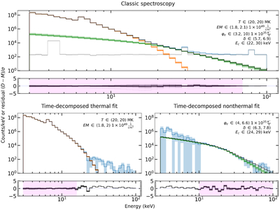
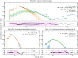
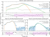
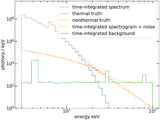
Caption: Figure 10.
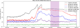
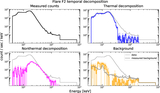
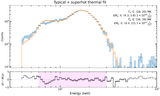
A summary plot for the typical simulated flare. The blue lines are the data, orange lines are the thermal bremsstrahlung fits, and green lines are the cold thick-target fits. The pink regions in the residual plots indicate the energy fitting ranges. The gray line in the first panel is the background. The top panel shows traditional spectroscopy, and the bottom two panels show the results from the time-decomposed fits. The plots are annotated with 95% χ2 parameter intervals. There are many MCMC samples overplotted to give a sense of model variation. The black lines are the true spectra.
Other Images in This Article
Show More
Copyright and Terms & Conditions
© 2026. The Author(s). Published by the American Astronomical Society.
Copyright ©
2026 Astronomy Image Explorer. All Rights Reserved.