Image Details
Caption: Figure 5.
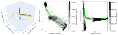
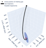
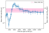
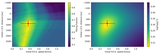
The best-fitted trajectory from TIPSY, as discussed in Section 4.1, compared to C18O (2–1) data. The left panel shows the full 3D PPV diagram of the molecular-line data, with the black line denoting the best fit. The center and right panels show integrated intensity (moment 0) and position–velocity diagrams for the streamer, respectively, with green curves representing the best fit. Thinner curves in all panels represent trajectories generated from 30 parameter combinations, randomly sampled from a Gaussian distribution based on the uncertainties of the fitted trajectory. An interactive version of the left panel is available online, allowing rotation and zooming of the 3D structures.
An interactive version of this figure is available in the online article.
An interactive version of this figure is available.
An interactive version of this figure is available in the online journal.
Other Images in This Article
Copyright and Terms & Conditions
© 2026. The Author(s). Published by the American Astronomical Society.