Image Details
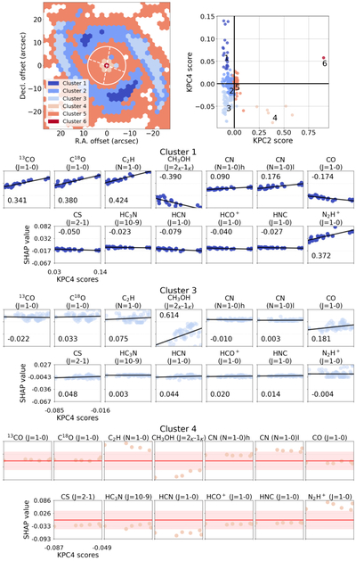
Caption: Figure 6.
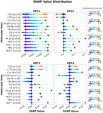
The left panel in the first row shows the cluster map, while the right panel presents the clustering result. The second row illustrates the relationship between the SHAP values and the scores in Cluster 1, and the third row shows the corresponding relationship for Cluster 3. The numbers in the plot represent the correlation coefficients. The fourth row shows the relationship between the SHAP values and the scores in Cluster 4. In each plot, the red line indicates the mean SHAP value, and the light red region represents the 1σ range.
Other Images in This Article
Copyright and Terms & Conditions
© 2026. The Author(s). Published by the American Astronomical Society.
Copyright ©
2026 Astronomy Image Explorer. All Rights Reserved.