Image Details
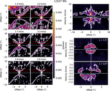
Caption: Figure 1.
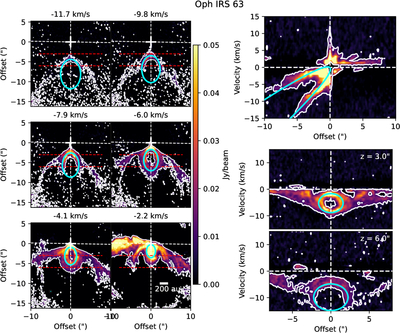
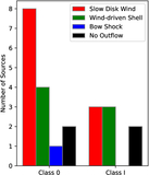
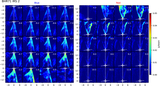
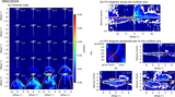
Maps of representative velocity channels (left), P–V diagram along the axis of the outflow (top right), and the P–V diagrams perpendicular to the outflow axis at 3″ (middle right) and 6″ from the protostar (bottom right) for Oph IRS 63. This is the best example of an outflow showing wind-driven shell emission in the eDisk sample. The white contours show the 5σ level of the emission, where σ is the rms noise level given in Table 2. The channel map is rotated so that the outflow axis is in the vertical direction in the panel. The velocity is also shifted to the relative velocity to the systemic velocity. The PAs of the outflow axis and systemic velocity are listed in Table 4. The white dashed lines in the channel map depict the outflow axis and PAcont, while the red dashed lines depict the offset positions for the P–V diagrams perpendicular to the outflow axis. Cyan lines depict the model for shell B1 described in Section 5.1. The synthesized beam of the observation is shown by the cyan filled ellipse in the bottom left velocity channel map. A scale bar indicating a distance of 200 au is shown in the bottom-right velocity map.
Other Images in This Article
Copyright and Terms & Conditions
© 2026. The Author(s). Published by the American Astronomical Society.