Image Details
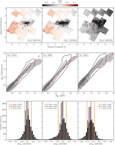
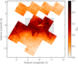
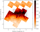
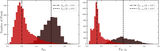
Caption: Figure 13.
Comparison of extinction maps from this work with those from G18, S20, and Z22. The top row shows the difference between our extinction map, derived from fitting Equation (1), and the literature maps, within the UKIRT fields. The middle row displays extinction distributions using a Gaussian kernel density estimator: black open contours represent values from the luminosity function fit, while gray filled contours show extinction derived from color excess and the S. Wang & X. Chen (2019) extinction law. The bottom row shows histograms of the differences in extinction values, with black bars for the luminosity function fit and gray bars for the color excess method. Dashed lines indicate the percentiles of ﹩{\rm{\Delta }}{A}_{{K}_{S}}﹩ from the luminosity function–based extinction.
Other Images in This Article
Show More
Copyright and Terms & Conditions
© 2025. The Author(s). Published by the American Astronomical Society.