Image Details
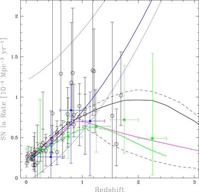
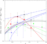
Caption: Figure 6.
Different fits to the currently available SN Ia rate data, up to a redshift z ≃ 2.25. The solid black line is a fit to the rates given in Table 6 by Graur et al. (2014) and the two black dashed lines its ±1σ limits. The blue solid line running up to the upper edge of the diagram is the fit by Okumura et al. (2014) to the Subaru/XMM-Newton Deep Survey data, and the two dotted lines the ±1σ limits. The green solid line is the fit to the CANDELS data (shown as green squares) alone, from Rodney et al. (2014), while the magenta solid line corresponds to the SN Ia rates adopted by HB2010 (private communication). The open circles are the data from different surveys, covering from z = 0 up to z ≃ 1.7 (see the text for the references). Note that, when comparing with the previous figure, the vertical scale is here linear instead of semilogarithmic. The ±1σ regions around the rates from Okumura et al. (2014) have been traced by calculating the error using the statistical and systematic errors of the points measured by these authors. Note that the upper systematic errors include 50% extinction by dust, which explains why the upper error line is more distant from the main fit than the lower one.
Other Images in This Article

Show More
Copyright and Terms & Conditions
© 2016. The American Astronomical Society. All rights reserved.