Image Details
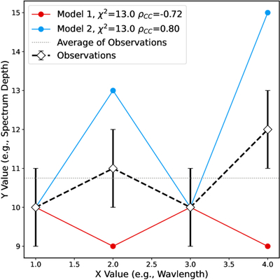
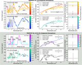
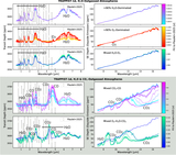
Caption: Figure A1.
An example dataset (black points connected by dashed lines) compared to two models (red and blue lines). The average of the observations is shown by the dotted gray line to allow better by-eye comparisons. While the models both display the same χ2 fit (13 in this case), model 1 and 2 are strongly negatively and positively correlated, respectively, suggesting model 2 may be a better overall fit if this example is taken to represent transmission spectra.
Other Images in This Article
Show More
Copyright and Terms & Conditions
© 2026. The Author(s). Published by the American Astronomical Society.
Copyright ©
2026 Astronomy Image Explorer. All Rights Reserved.