Image Details
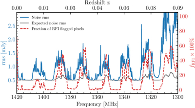
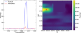
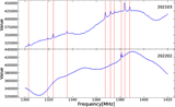
Caption: Figure 2.
Frequency dependence of the noise level (blue curve, left axis) and the corresponding fraction of RFI-masked pixels (red dashed curve, right axis). The bottom axis shows the observed frequency in MHz, while the top axis indicates the corresponding redshift of the HI line. The secondary y-axis illustrates the fraction of RFI-masked pixels over the same frequency range. The gray curve represents the expected rms increase induced by RFI flagging, which is estimated via Equation (6).
Other Images in This Article
Show More
Copyright and Terms & Conditions
© 2026. The Author(s). Published by the American Astronomical Society.
Copyright ©
2026 Astronomy Image Explorer. All Rights Reserved.