Image Details
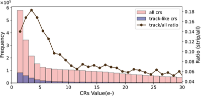
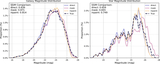
Caption: Figure 4.
CR intensity distribution from simulated images. The left y-axis displays frequency distributions: brown bars represent all CRs, while purple bars represent track-like CRs. The right y-axis shows the ratio of track-like to all CR counts (black line).
Other Images in This Article


Copyright and Terms & Conditions
© 2025. The Author(s). Published by the American Astronomical Society.
Copyright ©
2026 Astronomy Image Explorer. All Rights Reserved.