

Image Details
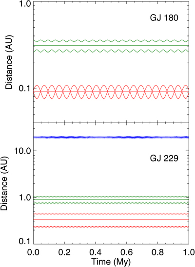
Caption: Figure 31.
One sample of the dynamical simulations for GJ 180 (upper) and GJ 229 (lower) over one million years. The three curves of each color show the apastron distance, semimajor axis, and periastron distance for a planet. In the upper panel, the red curves represent GJ 180 b, and the green curves represent GJ 180 d. In the lower panel, the red, green, and blue curves represent GJ 229A c, GJ 229 b, and GJ 229B, respectively.
Other Images in This Article
Show More
Copyright and Terms & Conditions
© 2020. The American Astronomical Society. All rights reserved.

Copyright ©
2026 Astronomy Image Explorer. All Rights Reserved.
