Image Details
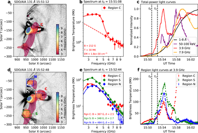
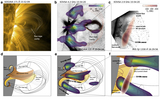
Caption: Figure 4.
Spatially resolved microwave spectra and light curves of the erupting flux rope. (a) and (d) EOVSA multifrequency microwave images at two selected times (t0 = 15:51:08 UT and t1 = 15:52:44 UT). Filled contours from red to blue indicate increasing microwave frequency (showing 32% of the maximum brightness at each frequency). Background images are SDO/AIA 131 Å images at the closest time, enhanced using the unsharp masking technique (shown in inverse color scale—black means greater intensity). (b) Microwave brightness temperature spectrum Tb(ν) obtained from the flux rope core region (region “C,” marked as a red box in (a)) at t0 = 15:51:08 UT. Each value at a given frequency represents the peak Tb within the selected region. Solid curve shows the best-fit results based on thermal gyrosynchrotron and free–free emission. Dashed line shows the free–free component that dominates the high-frequency portion of the spectrum. (e) Similar to (b), but the microwave brightness temperature spectra are for t1 = 15:52:44 UT obtained from three different regions marked in (d), which correspond to the flux rope core (red box “C”), northern flux rope footpoint (blue box “N”), and southern flux rope footpoint (green box “S”), respectively. Solid curves are best-fit results based on nonthermal gyrosynchrotron emission. (c) Total-power (i.e., full-Sun integrated) GOES SXR 1–8 Å (black), EOVSA microwave 3.9 GHz (red), 7.9 GHz (orange), and RHESSI HXR 50–100 keV (purple) light curves. The two selected times are indicated by the vertical dashed lines. (f) Spatially resolved microwave brightness temperature light curves at 3.9 GHz, obtained from the three selected regions in (d). They show similar temporal evolution during the first impulsive peak around 15:54 UT. The steep increase of the central source “C” (red curve) after ∼15:58 UT is due to the rising microwave source at the looptop entering the selected region (red box) during the main flare peak.
Other Images in This Article
Copyright and Terms & Conditions
© 2020. The American Astronomical Society. All rights reserved.