Image Details
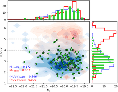
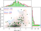
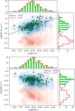
Caption: Figure 9.
NUV–r vs. Mr of our sample overplotted on the comparison sample, with the underlying contours representing the high- and low-sSFR subsamples (in blue and red, respectively). Black dashed lines denote the “green valley” (Salim 2014). The NUV–r color distribution more strongly agrees with that of the high-sSFR parent sample. Both NUV and r magnitude values shown are drawn from the NASA-Sloan Atlas1.
Other Images in This Article
Show More
Copyright and Terms & Conditions
© 2020. The American Astronomical Society.
Copyright ©
2025 Astronomy Image Explorer. All Rights Reserved.