Image Details
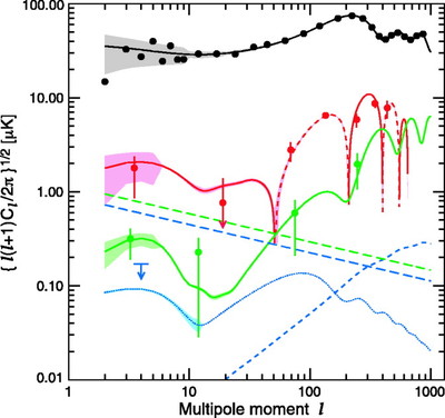
Caption: Fig. 25.
Plots of signal for TT (black), TE (red), and EE (green) for the best‐fit model. The dashed line for TE indicates areas of anticorrelation. The cosmic variance is shown as a light swath around each model. It is binned in ﹩l﹩ in the same way as the data. Thus, its variations reflect transitions between ﹩l﹩ bin sizes. All error bars include the signal times noise term. The ﹩l﹩ at which each point is plotted is found from the weighted mean of the data comprising the bin. This is most conspicuous for EE, where the data are divided into bins of ﹩2\leq l\leq 5,\ 6\leq l\leq 49,\ 50\leq l\leq 199﹩, and ﹩200\leq l\leq 799﹩. The lowest ﹩l﹩ point shows the cleaned QV data, the next shows the cleaned QVW data, and the last two show the precleaned QVW data. There is possibly residual foreground contamination in the second point because our model is not so effective in this range as discussed in the text. The level of foreground contamination in rightmost two EE points could be roughly σ/2. For BB (blue dots), we show a model with ﹩r=0.3﹩. It is dotted to indicate that at this time WMAP only limits the signal. We show the 1 σ limit of 0.17 μK for the weighted average of ﹩l=2{\mbox{--}} 10﹩. The BB lensing signal is shown as a blue dashed line. The foreground model (eq. [25]) for synchrotron plus dust emission is shown as straight dashed lines with green for EE and blue for BB. Both are evaluated at ﹩\nu =65﹩ GHz. Recall that this is an average level and does not emphasize the ﹩l﹩‐values where the emission is low.
Other Images in This Article
Show More
Copyright and Terms & Conditions
© 2007. The American Astronomical Society. All rights reserved. Printed in U.S.A.