Image Details
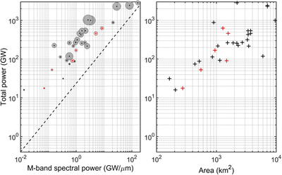
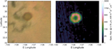
Caption: Figure 5.
Left: gray circles represent the spectral power in the M-band (centered at approximately 4.78 μm and with 0.5 μm of bandwidth) in GW/μm on the x-axis, plotted against the total power in GW on the y-axis. For comparison, the dashed line indicates the empirical relationship employed by Davies & Veeder (2023) and J. E. Perry et al. (2025): y = 23.702x0.8838, where y is the total thermal emission in GW and x is the 4.8 μm spectral power in GW/μm. Circles are sized according to the area of the patera/lake. Red circles/dots are cases where the estimation is less reliable (see the discussion and Table 2 for details). Right: same, plotting the total power in GW on the y-axis as a function of the area of the patera/lake on the x-axis.
Other Images in This Article
Copyright and Terms & Conditions
© 2026. The Author(s). Published by the American Astronomical Society.