

Image Details
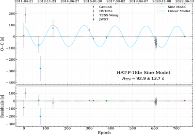
Caption: Figure 14.
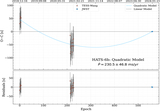
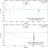
O − C diagram for HAT-P-18 b. Top: the O − C diagram with the gray dashed line denotes the best-fit linear ephemeris, the blue curve shows the fitted sine model, and the annotated value gives the measured amplitude ATTV. Data points are color coded by source. Bottom: the residuals from the best-fit sine model and the observed data.
Other Images in This Article
Show More
Copyright and Terms & Conditions
© 2026. The Author(s). Published by the American Astronomical Society.

Copyright ©
2026 Astronomy Image Explorer. All Rights Reserved.
