

Image Details
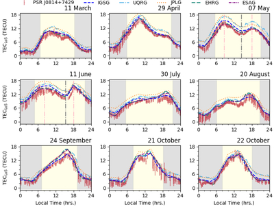
Caption: Figure 2.
The time series of electron density within the ionosphere along the LoS (TECLoS) as a function of local time during a day for nine representative observations, where the red points represent the TECLoS calculated by the pulsar signal (labeled as PSR J0814+7429); different colors and line styles (labeled on the top of the Figure) correspond to TECLoS obtained from different global ionospheric maps. The meanings of the gray area, yellow area, and the boundaries between them are consistent with Figure 1. In the corresponding subplots on May 7 and June 11, the vertical pink dotted lines mark the peak positions before and after the noontime bite-out, while the vertical gray dotted lines indicate the minimum value during the bite-out (see Section 3.3). The observation time is labeled in the upper-right of each plot. Selected unit: 1 TECU = 1 × 10¹⁶ electron m−2.
(The data used to create this figure are available in the online article.)
(The data used to create this figure are available.)
Other Images in This Article
Copyright and Terms & Conditions
© 2026. The Author(s). Published by the American Astronomical Society.

