Image Details
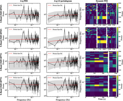
Caption: Figure 2.
Averaged PDS, averaged LS periodogram, and dynamic PDS of the observations on MJD 60765 (top two rows) and MJD 60772 (bottom two rows). The first and third rows present the results for the S band, while the second and fourth rows present the X-band results. For each observation date and band, the left column displays the observed averaged PDS (black data points with error bars), the middle column displays the averaged LS periodogram (black data points), and the right column shows the corresponding dynamic PDS. In the averaged PDS and LS periodogram panels, the dashed red line represents the best-fit power-law model, and the gray shaded region represents the 1%–99% percentile range of the simulated power at each frequency. This percentile demonstrates the typical power level reached by most simulated PDSs and provides a visual comparison with the observed PDS. It is not used to define the significance of the QPO detection. In addition, the apparent peaks observed above 0.06 Hz are consistent with being harmonics of the fundamental 0.03 Hz. The white vertical blank regions in the dynamic PDS correspond to the time intervals between individual observation scans used for flux calibration.
Other Images in This Article
Copyright and Terms & Conditions
© 2026. The Author(s). Published by the American Astronomical Society.