Image Details
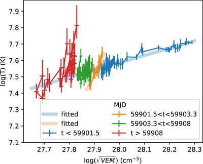
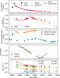
Caption: Figure 9.
The ﹩0.5\mathrm{log}\sqrt{\mathrm{VEM}}-\mathrm{log}T﹩ diagram for a single-temperature model. The thick, partially transparent blue line is the best fit to the data before MJD = 59901.5 and also describes the data after MJD 59903.3 reasonably well. The thick, partially transparent orange line is the best fit for the period in between. It is much steeper, consistent with little or no reheating. Data shown in this figure are included in the “data behind the figure” for Figure 7.
Other Images in This Article
Copyright and Terms & Conditions
© 2024. The Author(s). Published by the American Astronomical Society.
Copyright ©
2025 Astronomy Image Explorer. All Rights Reserved.