Image Details
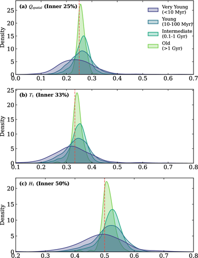
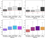
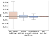
Caption: Figure 2.
Evolution of spatial mass-segregation metrics visualized using KDE plots. The metrics Q1, T1, and H1 correspond to the mass fractions within the inner 25%, 33%, and 50% of the cluster. The dashed red lines indicate the expected values for a spatially random distribution. Note that the “Very Young” population (blue) is symmetrically distributed around the random baseline, indicating that the spread is due to stochastic noise rather than physical segregation. In contrast, the “Old” population (red) exhibits a systematic shift to the right, indicating genuine dynamical segregation.
Other Images in This Article
Copyright and Terms & Conditions
© 2026. The Author(s). Published by the American Astronomical Society.
Copyright ©
2026 Astronomy Image Explorer. All Rights Reserved.