Image Details
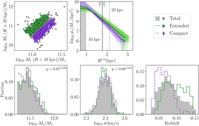
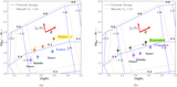
Caption: Figure 4.
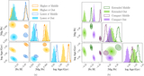
The top-left plot shows the sample-split scheme, where galaxies are categorized by position on the ﹩{{\rm{log}}}_{10}({M}_{\star ,R\gt 10\,{\rm{kpc}}}/{M}_{\odot })﹩ vs. ﹩{{\rm{log}}}_{10}({M}_{\star ,R\gt 20\,{\rm{kpc}}}/{M}_{\odot })﹩ plane. The two samples have similar inner stellar masses (M⋆,R<10 kpc); the green circles represent galaxies with more extended outskirts (extended), and the purple diamonds represent more compact galaxies (compact). As before, the total sample is in gray circles. The top-right plot displays the radial profiles of stellar mass density (M⊙ kpc–2), with the thick lines representing the median profiles. The green solid lines and purple dashed lines correspond to the extended and compact samples, respectively. The gray-filled bar represents the total sample. Similar to Figure 3, the histograms show the M* (bottom left), σ⋆,cen (bottom middle), and redshift (bottom right). We also show the p-values (with errors from resampling the original sample in their respective uncertainties. For M⋆,R>20 kpc, we assume a 0.1 dex error) of the K-S tests on the M* (bottom left) and σ⋆,cen (bottom middle) distributions between the two subsamples on the first two histograms. The Jupyter notebook for reproducing this figure can be found here: ✎. This repository is also available on Zenodo (https://doi.org/10.5281/zenodo.17979404).
Other Images in This Article
Show More
Copyright and Terms & Conditions
© 2026. The Author(s). Published by the American Astronomical Society.