Image Details
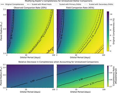
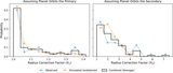
Caption: Figure 5.
Modifications to the Kepler survey completeness for our sample, based on the simulated presence of stellar companions using (left) the properties of our observed companion sample at their observed rate of 20%, or (right) a combination of properties from our observed and simulated undetected companions at the field rate of 45%. Top: the color map denotes the original (i.e., Scenario 1) Kepler average survey completeness, with black solid contours at the 0.1%, 1%, and 10% levels. Other contours represent the average completeness maps from scenarios where some stars are assigned companions, shifting their completeness grids vertically upwards. These shifts depend on radius correction factors drawn assuming planets orbit the primary (dotted; Scenario 2), secondary (dashed; Scenario 3), or a mix of the two (dotted–dashed; Scenario 4). Bottom: the color map denotes the ratio of average completeness maps with vs. without companions (Scenarios 4 and 1, respectively). Contours show where the Scenario 4 map equals either 75%, 80%, or 90% of the original Scenario 1 map.
Other Images in This Article
Copyright and Terms & Conditions
© 2026. The Author(s). Published by the American Astronomical Society.